Page 1 of 1
Posted: Mon May 22, 2006 12:47 am
by Squirrel
Before voting here's the pics.
I dunno who did the ink outlines but if you know please PM me. Remember your voting on the one that really stands out.
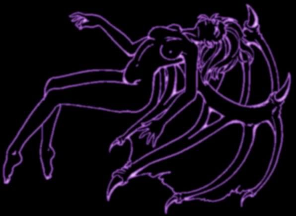
1)
http://img.photobucket.com/albums/v215/aur.../demon-ink1.jpg
2)
http://img.photobucket.com/albums/v215/aur.../demon-ink2.jpg
3)
http://i4.tinypic.com/10dhxe8.jpg
Posted: Mon May 22, 2006 4:15 am
by kaos
i went with the first.
the second seems a bit fuzzy
and the 3rd seems a tad bright in places.
Posted: Mon May 22, 2006 8:34 am
by Chewi
Yep first.
Did you use my technique or something else? Doesn't look like you did, which is probably a good thing.

Posted: Mon May 22, 2006 10:58 am
by Trigo
i voted one as it does look the best.
Posted: Mon May 22, 2006 12:00 pm
by Mik
First is probably the best of the three,
Second is far too much blur and feels to soft.
Third is sharp, too sharp it's line art so there isn't much there, making it soo defined takes away from it.
Posted: Mon May 22, 2006 3:54 pm
by Super Goat Weed
i voted 3, but i like my screen to be dark, so it might be overly bright to the rest of you.
Posted: Wed May 24, 2006 10:58 am
by Mik
it can't be darker than mine, trust me ... I can barely see the links because black and blue are that close

Posted: Fri May 26, 2006 2:42 am
by Bogey
The 3rd looks like a neon sign you'd see on the titty twister, so my vote goes there.
Posted: Sat May 27, 2006 11:43 pm
by Squirrel
Thanks guys. Aww nobody voted for the 2nd one. Well I didn't like that one either